
Among the People
Directed by JODY CLEAVER
Australia, 2022
Experimental
Synesthesia and music medicine in watercolours.
Read our interview with Jody below to learn more about the film.
JODY CLEAVER
Learn More
Est. Reading Time: 6 Minutes
On Colour Design
M I’ve read your artistic statement which provides interesting details about your approach to the film’s colour design. Please briefly discuss Roy de Maistre’s 'colour-music' and Kemp Prossor's 'colour-medicine' theories here for readers. And please let us know how these theories guided and influenced the film’s colour palette.
J De Maistre was an Australian artist trying to chart notes to colours, and he made paintings which were visual versions of songs as well as long rolls to interpret compositions which are currently held in museum collections. He also made an interactive chart with a wheel which he got commercially printed in 1917, and it became very popular with interior designers to find harmonious colour palettes.
His friend and contemporary Kemp-Prossor was also interested in colour theory. Having studied ‘colour-medicine’ and the influence of colour on children and adults, Kemp-Prossor redesigned the interiors of hospitals (entirely at his own expense, he apparently sold his own house!) to help relieve the suffering of shell-shocked soldiers. His colour wards were described as 'the ceiling firmament blue, walls sunlight yellow, woodwork Spring Green and floor and furniture primrose yellow...all the air is thrilling with the Spring’. He tried to bring sunshine and early spring to the surroundings, and to avoid the feeling of confinement which were suggested by autumn colours of decay and death. Kemp-Prossor also showed great attention to detail in different aspects of the interiors such as matching the crockery and diet trays to the therapeutic colour scheme.

Roy de Maistre Colour Harmonising Chart

Roy de Maistre Colour Chart, Circa 1919

J Once I was well into the project, I started looking into objects of meditation and alternative music notation: in a rare edition book by Theresa Sauer ‘Notations 21’ I found an image of an 8th century Egyptian visual notation: different size circles of different colours. I had started with using solely round shapes of different colours and sizes. Incredible, really. Interpretations of the notation was that the smaller dots were less volume, a similar style I had already. Some scholars have attempted to convert this 8th century notation to music based on a different interpretation of the notes to colours.

8th Century Ancient Egyptian Music Notation
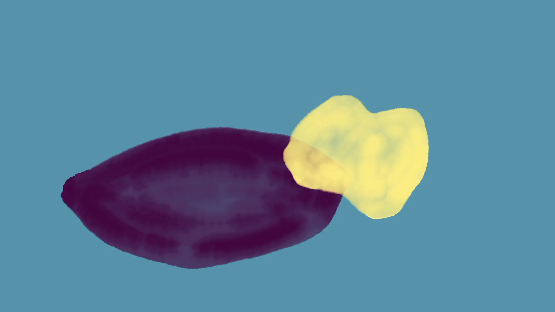
J I have referenced some of Kemp-Prossor’s work in the focus of the light greens, yellow and light aqua blues. I didn’t chart colours to notes in the same specific way as De Maistre, but I have put them in general as light, fast notes, and the lower notes as darker colours and descending runs of notes into physical placement. I have visualised very deep chords as a rounded diamond shape in maroon etc. and repeated some visual aspects as the music repeats. I guess as I dialled all this information in, I set my mind to a meditative state and improvised as I listened to Natalie’s work frame-by-frame, and then repetitively played it back in small segments to check the overall flow of the piece. I didn’t storyboard the film at all, I only made the first 20 seconds in application for the arts grant.

Berger's Matone Advertisement of Kemp Prossor's Work

J And the background colour is representative of the mood. It's very changeable in this piece. The rate at which the colours change follows the arc of the composition: the light greens, yellows, pinks and teals give a bright mood, and the more complex bars are more moody navy, violet and maroon which is my interpretation of the mood at that point in the piece. This occurs while also contrasting the main shapes. I had envisaged several different watercolour textures, both between the background and over the shapes: which did have a beautiful effect and depth, i.e. grey over green, with a light 10% opacity pink over the top... however as a whole it looked too chaotic, and distracting to the main two elements - the shapes and their opacity and quality, and the background. In the end I decided it was more important to focus the attention in a more straightforward presentation, which would also allow more than half the mind to focus on the music.


On Process & Discovery
M In making and finishing the film, what did you discover and learn that you might adopt or further explore in future projects?
J I discovered through the length of this film and the arduous process to finely develop the workflow. Even though I had already made 20 seconds before starting the production, I hadn’t compensated for the amount of files I would need to take track and edit using this method. Quite a bit of my time was spent tracking the correct files and re-doing missing frames from re-colouring. And I have to say, because I was dependent on improvising, I would have to be in a perfect mindset to be inventing the shapes, speed and colours: as the composition became more complex, I became quite intimidated by the task and would often just watch it repetitively without drawing and basically, draw a blank. I would get wired on coffee. Then the time became intimidating - I wasn’t on track with the deadline set for the Arts Grant.

J I think when I gave myself a few parameters, relaxed and permission to being playful again, I started to move forward quickly with the project. I realised that you can’t give your attention to more than about four objects at once in this style with such complex music playing. I guess I felt pressure to present something as complex as the music. I found other ways such as speed and then using the relief of returning to a similar shape when the music returned to a similar passage. Nothing is repeated in the film, I was really kicking myself around the five minute mark, but I think the attention to detail pays off in its final form.
M Jody brings up an interesting point about the workload of creative projects. It can be generally tough to predict exactly how much time you will need to prepare and complete your project, and it’s especially tough when you’re method stems from a place of true discovery and surprise. So I think it’s normal for Jody to somewhat experience a few difficulties with the workflow of this project because it is fundamentally built upon improvisation and spontaneity.
Furthermore, I think Jody’s hard work absolutely paid off - the fact that nothing is repeated throughout the film is quite incredible and shouldn’t be understated. Near the end of my conversation with Natalie (N), she again highlighted the quality of Jody’s film, saying:
N It’s Jody's expression in (visual) art-form, she's got the emotion, the feel just right, it's just marvelous how she’s done it…sometimes you can't speak and put it into words (the feeling Jody’s film creates and evokes) you know what I mean, but it’s there, and I’m really happy the film’s being looked at with interest.


The founder of Hommage, Mark Shaba published this interview on 13.08.2022. Mark is a filmmaker from Victoria, Australia. He respectfully acknowledges the past and present traditional owners of the land on which he creates, promotes and screens art, the Wurundjeri people of the Kulin nation who are the custodians.
-
![]()
‘LOTUS’ A dance piece that touches on life, death, rebirth and the solitude of internal catharsis.
-
![]()
‘Chado’ Child grapples with intrusive thoughts after the death of her dog & the sudden arrival of her Mother's new lover.
-
![]()
‘Abound Box’ A cascade of small moments that live within the margins of experience.
-
![]()
‘0000E8’ An object, alien in its identity & intangible in its form, suddenly appears.
-
![]()
‘Imagine none of this is real’ A strange, melancholic travelogue through the post-human world.
-
![]()
‘Spinning into Silence’ A personal look at living with Vestibular Disorder.
-
![]()
‘Dad Tax’ A tribute to the artist's contradictory but understanding relationship with her father.
-
![]()
‘The Waltz’ A metaphorical dance between life & death.


