Dad Tax

Directed by IDA LASIC
United States, 2021
Experimental
A tribute to the artist's contradictory but understanding relationship with her father.
Read our interview with Ida below to learn more about the film.
IDA LASIC
Est. Reading Time: 6 Minutes
MARK (M) Tell us a little about yourself - when did you become interested in film and filmmaking?
IDA (I) Well my name is Ida Lasic and I’m a mixed-media animator. My family immigrated from Croatia one year before I was born so I got the double passports and I’ve been told if I was an animal I would be a horse. Or a flamingo. But I think horse suits me better. I’ve always been interested in storytelling. From childhood, me and my sister would draw and act out characters, and then as a teenager I spent a lot of time in my school library reading comics and decided that’s what I wanted to do with my life. But back then my drawing style was really rushed and simple so I was told that I would have a better hand at animation instead. Suddenly, unlike the previous mediums, I had control of the pacing, sound and different things that really pushed for a full body experience so to speak. Since then I’ve been hooked.


M The concept of your film is really interesting, I like the idea of exploring the underlying connection and love between two people who might frequently engage in a seemingly ordinary transaction. Please tell us a little about how you developed the idea of your film.
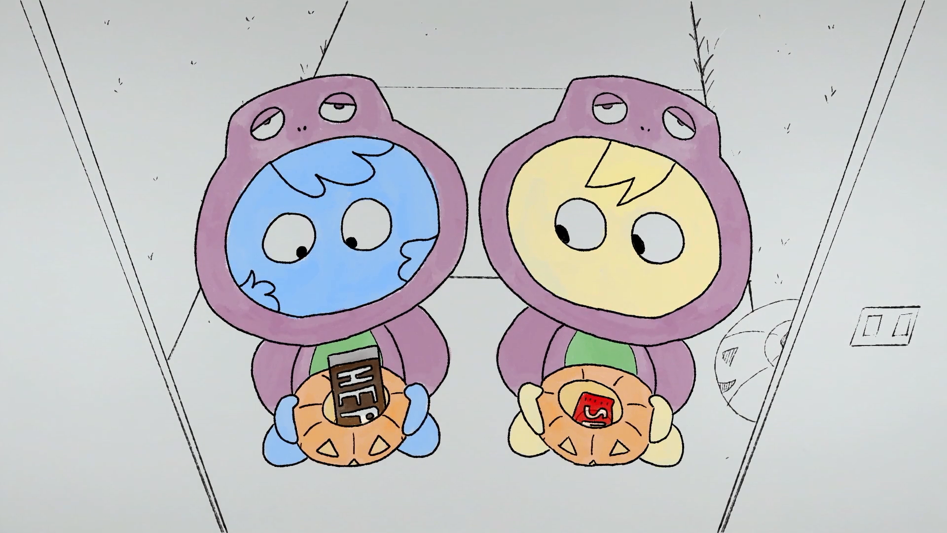
I It all came from a meme. I would see these images of dads putting their hands out to the backseat of a car with the text ‘DAD TAX’. It wasn’t for a while until I realized that it meant the dad wanted some of the kid’s snacks because whenever my father did/does that action, it was to hold me and my sister’s hands. That’s why the candy always falls out of the hand in the film because that’s not what he wants. My father is a hard-working and generous man but his reward isn’t more gifts, it’s simply love, someone saying ‘I see you’.


M And please tell us about the experience of sharing and watching the film with your father - how did he react to the film?
I Funnily enough, it was after we got into a petty argument and made up that I showed him the film. In a way it was additional proof to show that I loved him but of course coming down from that argumentative high made the first watching experience a little tense. But still, it was nice. My mother is a big critic over the arts but my dad always loves my work. The only thing he was ‘upset’ about is that I didn’t ask him to voice it! Now whenever I tell him the film got accepted to another festival he beams up with joy, I think he feels like a bit of a celebrity haha!

On Visual Style
M I love your visual style - it’s very unique! I really love the fact that it’s quite minimal yet provides just enough visual information for viewers to see and make out the whole picture so to speak. Please tell us about your visual style - why did you choose to showcase the characters and world of the film through relatively simple shapes and lines?
I Aw shucks thank you. This was originally for a class where I only had a week to make it but I honestly don’t believe that really affected how I created the style. It wasn’t a crunch piece, it was just reflective of my current artistic state. I think my love for comics inspired the visuals for this piece. I’ve been seeing a lot of work with dark lines and minimal sets/colours so I just thought it would be interesting to make a film with that style. Me and my dad are so alike except for our eye colour so I thought that would be a great character design for us. We didn’t need bodies as we both talk through our eyes. Sometimes keeping it simple helps people relate to the narrative better as we fill in the dots with our own personal experiences. Perhaps in this film people can relate with their own parents.


M I love the film’s colour palette - it’s filled with very bold and stark primary colours which are eye-catching! I would love to learn more about your approach to colour - why did you decide to use stark primary colours to depict and represent the father-daughter relationship?
I I definitely think I went with primary colours because the film deals with a parent-child relationship and youth. They’re colours that, to me, are strongly connected to childhood but also candy. Think of how many candy bars include blue, red and yellow in their design; nearly all of them. It’s the sweet cravings but also nurturing to childhood nostalgia that make them appealing. I don’t think this film would have worked nearly as well with other colour schemes. The simplicity of primary colours helps strengthen the story of the relationship.


My father is a hard-working and generous man but his reward isn’t more gifts, it’s simply love, someone saying ‘I see you’
— Ida Lasic
On Process & Discovery
M In making and finishing the film, what did you discover and learn that you might adopt or further explore in future projects?
I I really like the flat style that I made with this film so I plan on experimenting with this style again, but probably not for a while. Even though it’s really fun and relatively easy to make, I don’t want to be using this style as a crutch in my art making.

On Inspiration
M What are some of the films and who are some of the filmmakers that inspire you, and why?
I Definitely Albert Birney and Ted Wiggin. Albert Birney’s film Bone Gym (2017) really changed my perspective on animation. It felt more like play and experimentation rather than being tied down to a narrative and structure. Ted Wiggin’s Lizard Ladder (2020) is what I consider another play work as he created a whole program that morphs drawings into new ones. Similar to tweening but in a way that appears like it’s actually changing and animating. He also used a primary colour scheme in his film and I saw how limiting your palette can really change the impact of a film.

Bone Gym (2017) by Albert Birney

Lizard Ladder (2020) by Ted Wiggin
On The Future
M What are you planning to make next?
I I’m currently working on my graduate thesis! It’s definitely a real change from this piece but I’m still having a lot of fun making it - I can’t wait to show it!
Mark’s Final Thoughts
Along with Ida, it’s nice to see young filmmakers like Baro Lee, Lindsay Scanlan and Samantha Pess make really thoughtful films about their family members. I'm happy Ida is able to share this film with her dad and use it to express her appreciation for their relationship.
I think Ida’s ability to encapsulate and highlight the essence of their relationship through eyes/eye colours demonstrates her strong instincts as an artist and storyteller.
Using primary colours to symbolise childhood nostalgia is a relatively simple but very effective choice. Ida also makes relevant points about their connection to the designs of sweets. I personally love the bright red background colour, it’s really striking on screen!
And I think it’s great that Ida wants to evolve and experiment with different visual styles in her upcoming projects. This shows her willingness to grow and push her creative boundaries as an artist.
The founder of Hommage, Mark Shaba published this interview on 05.04.2022. Mark is a filmmaker from Victoria, Australia. He respectfully acknowledges the past and present traditional owners of the land on which he creates, promotes and screens art, the Wurundjeri people of the Kulin nation who are the custodians.
-
![]()
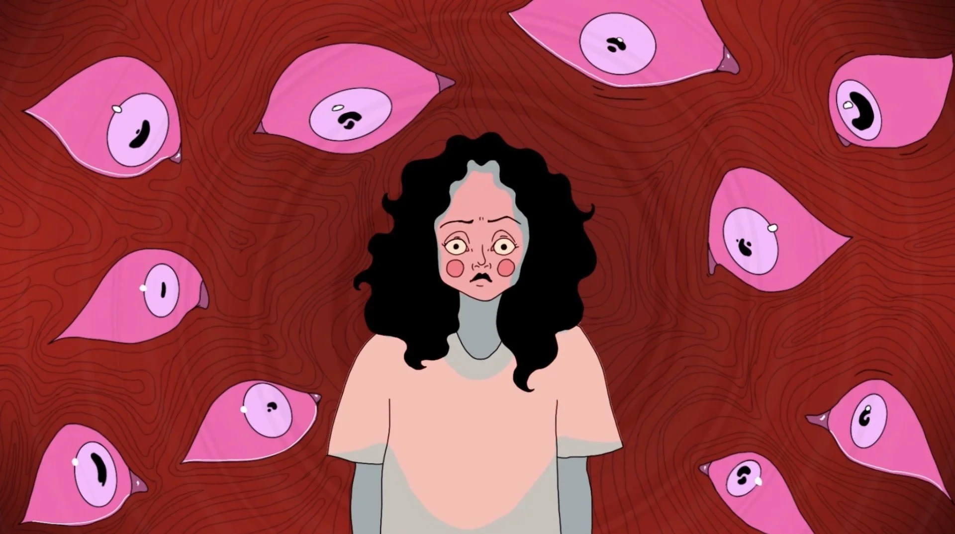
‘JUNGLE’ A girl wakes up to a morning existential crisis.
-
![]()
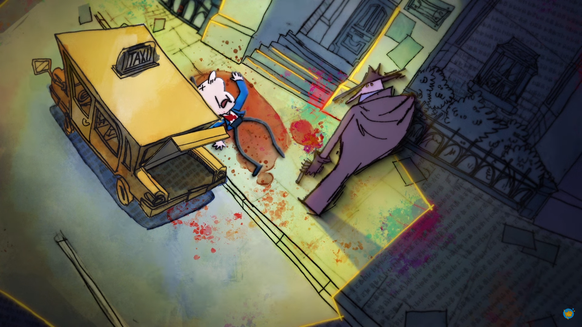
‘Call It A Day’ On the train ride home, an office worker becomes deeply immersed in a thrilling book.
-
![]()
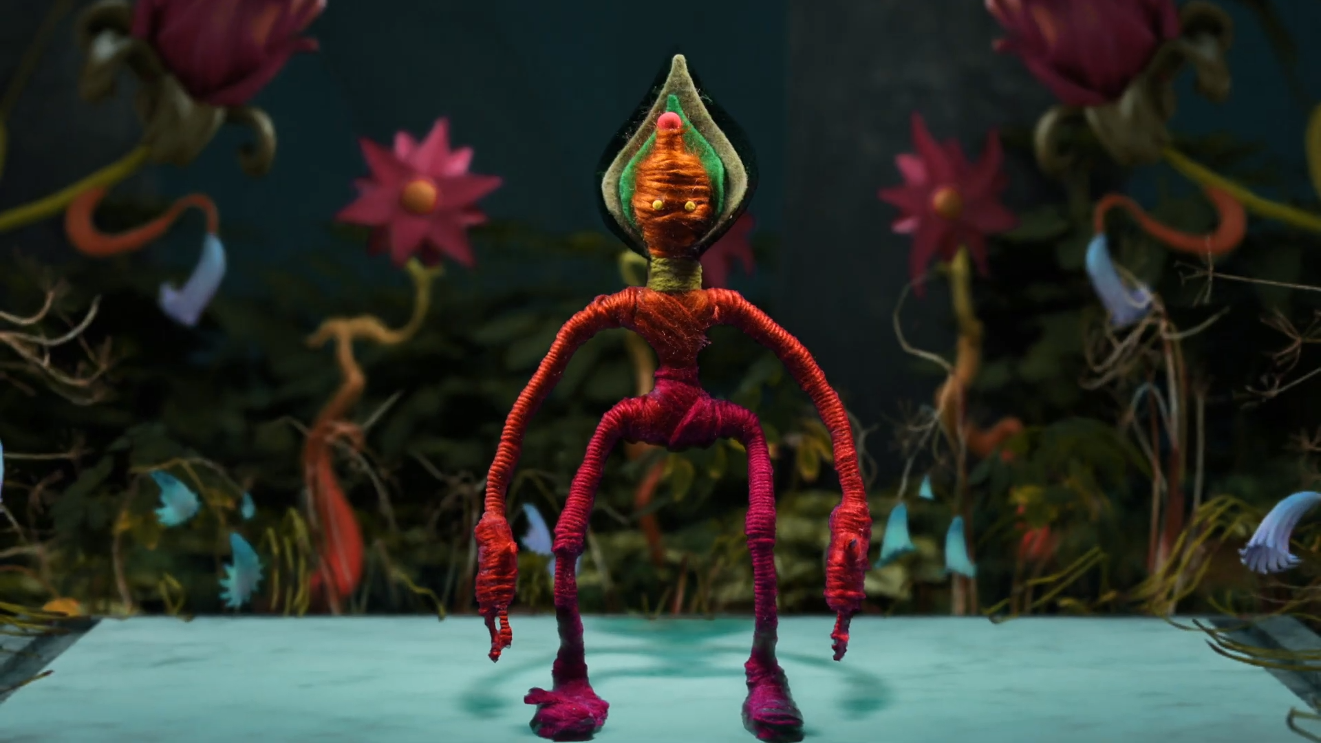
‘LOTUS’ A dance piece that touches on life, death, rebirth and the solitude of internal catharsis.
-
![]()
‘Among the People’ Synesthesia & music medicine in watercolours.
-
![]()
‘Lost Souls’ A soul in the afterlife learns how to find closure after losing contact with family and friends.
-
![]()
‘Midnight Garden’ The ecstatic joy of nature.
-
![]()
‘The Author’ A middle-aged writer flirts with death.
-
![]()
‘Spinning into Silence’ A personal look at living with Vestibular Disorder.
-
![]()
‘The Waltz’ A metaphorical dance between life & death.
-
![]()
‘Parked’ The melting point of a panic attack.
-
![]()
‘0000E8’ An object, alien in its identity & intangible in its form, suddenly appears.
-
![]()
-
![]()
‘Six to Six’ Sleepless nights see a new mother’s familiar home surroundings take on a dark, eerie appearance.
-
![]()
‘Departing’ A story about departing.
-
![]()
‘Two’ The story of a child named Blue. Her twin was Yellow. Together, they were two.